New London Architecture
Colour and urban legibility
Thursday 01 April 2021

When discussing the topic of ‘placemaking’, the work of veteran architect and urban design consultant, Jan Gehl, is a good place to start. Gehl has long championed a human-centric approach to urban design, where community wellbeing, health and happiness are the pillars of successful placemaking.
Over the years he and his team have conducted countless studies in cities around the world to understand to what degree particular elements of urban design inform the human experience of urban environments. In a report published in collaboration with CBRE, Gehl proposes that Protection, Comfort and Enjoyment are fundamental to users’ perception of space. These categories are closely linked and there is a clear graduation between them, just like Maslow’s hie
rarchy of needs.
At base level, consider Protection – an urban space needs to feel safe and secure for anyone to spend any time in it. Once achieved, the stage is set for a sense of Comfort. This can be enhanced by the ‘walkability’ of an urban environment and ease of orientation. Beyond that, great placemaking can bring Enjoyment. To succeed here an urban environment needs to possess a sense of place – a defined identity – that elevates it from being ‘just another space,’ and be an environment that captivates our senses.
As colour experts, we’re keen to explore the role of colour – an integral element of architectural design – in placemaking. Whilst of course, good architecture is a multisensory experience, the visual impact of buildings cannot be underplayed, and nor can the role of colour in our interpretation of what we see and how we understand our environment. Colour is crucial to the legibility of an urban space.
As American urban planner and author, Kevin Lynch, states in his seminal text, The Image of the City, ‘legibility is crucial’. When we think about feeling safe, feeling comfortable, and enjoying walking around an urban environment, we’re able to feel this way because we can understand it – we can read it – and its legibility is usually heavily reliant on visual cues.
Landmarks are key in the language of cities – and we don’t only mean the ones that show up on postcards. The café that always has a cat sat in the windowsill; a strangely shaped tree in a park; or a building with a bright pink wall that makes it stand out against its brick neighbours. These landmarks are excellent wayfinding tools and can also signify a transition between urban atmospheres.
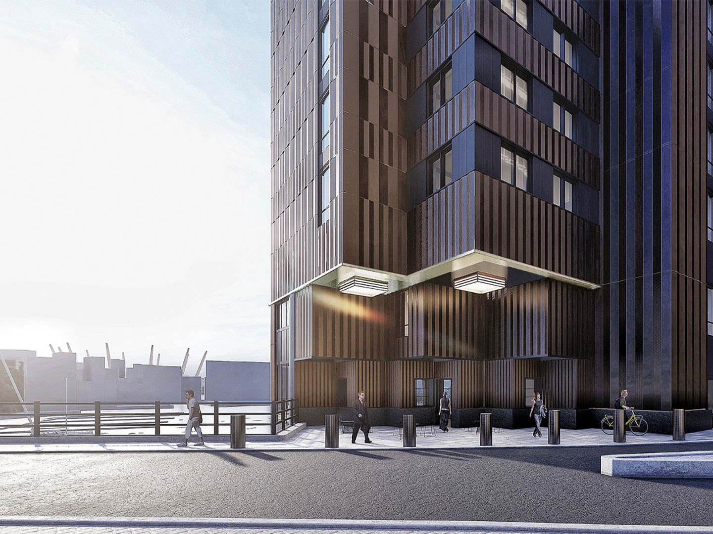
HTA's One Charter Street for the Canary Wharf Group

HTA’s One Charter Street apartment building has been described as a ‘gateway’ between Canary Wharf and Wood Wharf. The building connects two very different environments – an established financial district, home to vast skyscrapers of glass and steel, divided by wide boulevards; and a burgeoning cultural hub with narrower streets, more diverse building types and a sense of intimacy and ‘neighbourhood’. Taking cues from the art deco aesthetic, the building uses earth tones and golds to communicate this transition on the building’s facade.
“Colour rings the doorbell of the human mind and emotion and then leaves.”
Faber Birren (1900 – 88), colour consultant and theorist
Faber Birren (1900 – 88), colour consultant and theorist
As Lynch argues, legible environments not only provide security, but also ‘heighten the potential depth and intensity of human experience’. Humans are so attuned to the language of colour that it’s likely to be the first indicator of purpose and personality for any building. This makes it an especially powerful tool when it comes to enhancing the legibility of an urban environment where visual clarity is key.
www.axalta.com
www.axalta.com
Related
News
Shortlist Announced for Gateways to Whitechapel Design Competition
We're pleased to announce the shortlist for the Gateways to Whitechapel Design Competition with Tower Hamlets Council. T...
News
The shortlisted teams and their corresponding proposed designs for our 'Hope in the Square' design competition alongside...
Stay in touch
Upgrade your plan
Choose the right membership for your business
Billing type:
Small Business Membership
£90.00
/month
£995.00
/year

For businesses with 1-20 employees.
Medium Business Membership
£330.00
/month
£3,850.00
/year

For businesses with 21-100 employees.
View options for
Personal membership


